
Case Study: DAILY GRIND COFFEE ROASTERS
Coffee Roasters & Café
Scope: Naming · Logo Design · Brand Identity
Overview
Daily Grind is an independent coffee roaster and café brand built around the ritual of everyday hustle. The name celebrates the daily rhythm of work, creativity, and connection — all fueled by exceptional coffee.
Challenge
Develop a visual identity that:
Feels bold, modern, and unpretentious
Stands out in a crowded specialty coffee market
Scales easily across packaging, signage, and digital channels
Solution
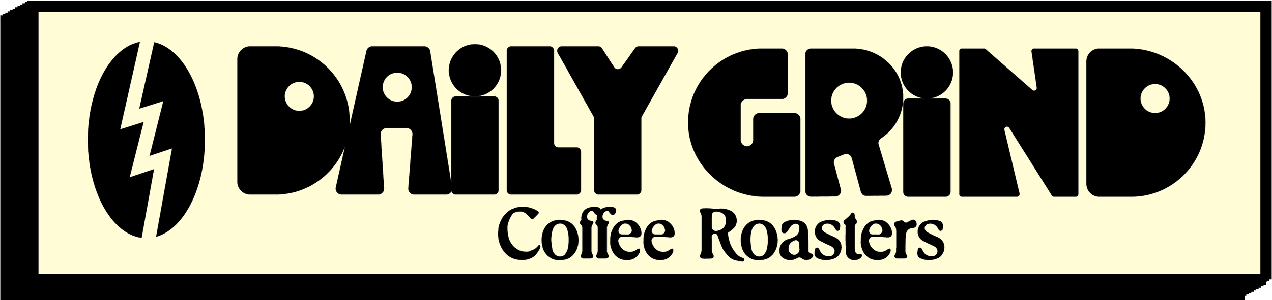
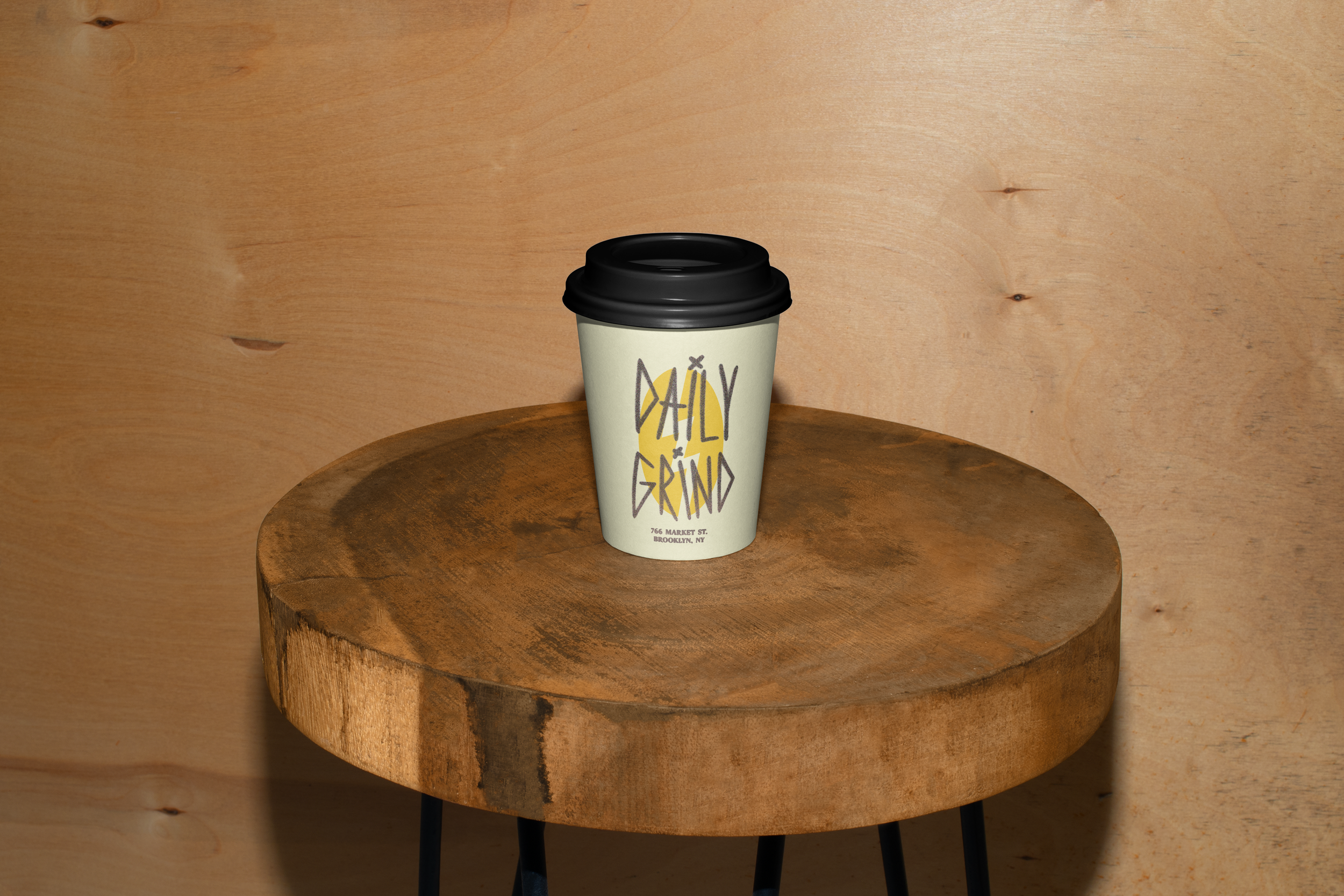
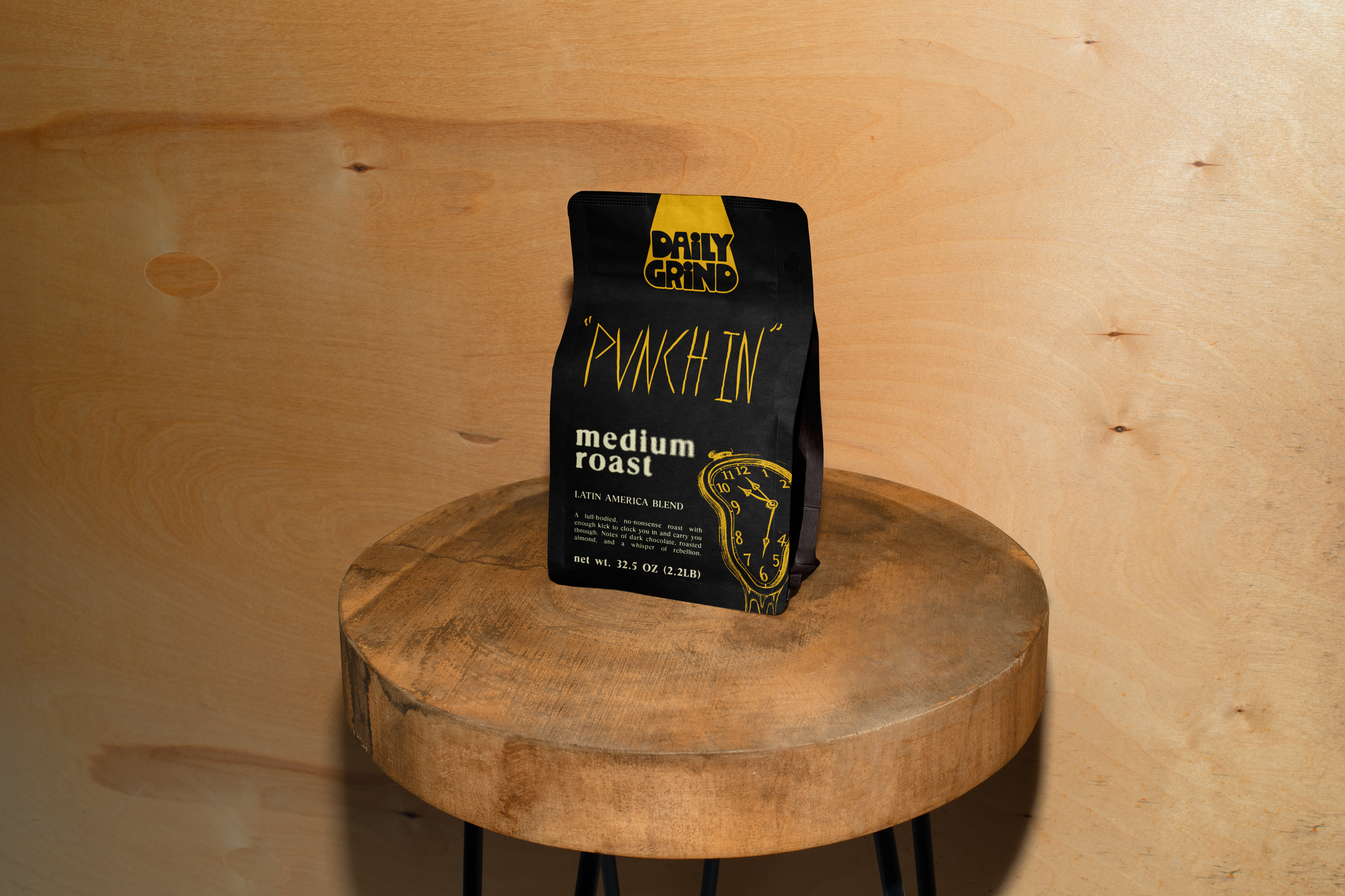
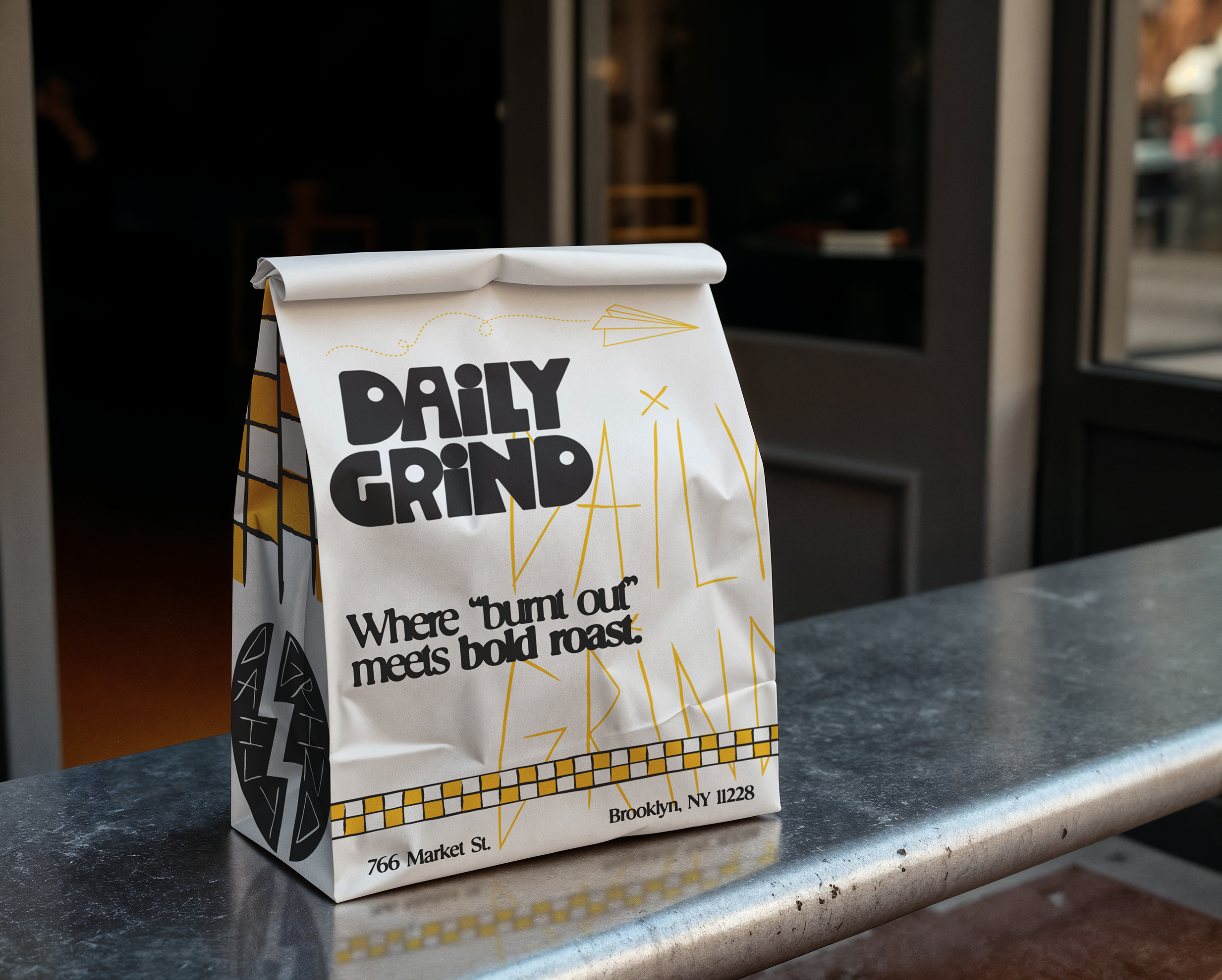
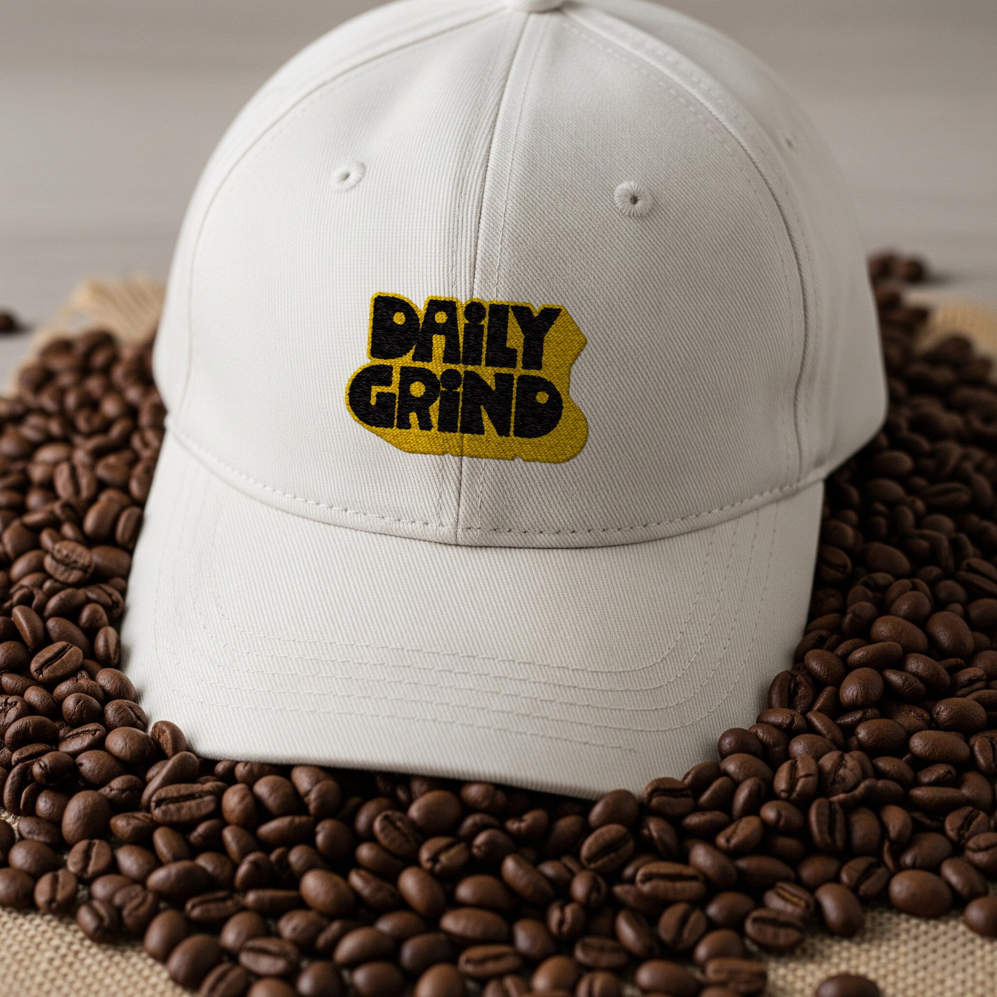
We created a heavy, geometric wordmark inspired by vintage type and modular café signage. The stacked configuration emphasizes Daily and Grind as separate beats, while the solid forms create instant impact.
Circular counters in each letter hint at coffee beans, mugs, and the cyclical nature of daily life. The tight spacing and bold forms convey energy and consistency — core to the brand’s promise.
Outcome
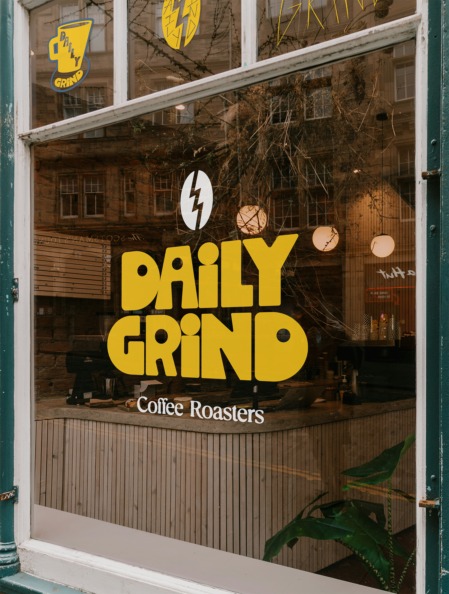
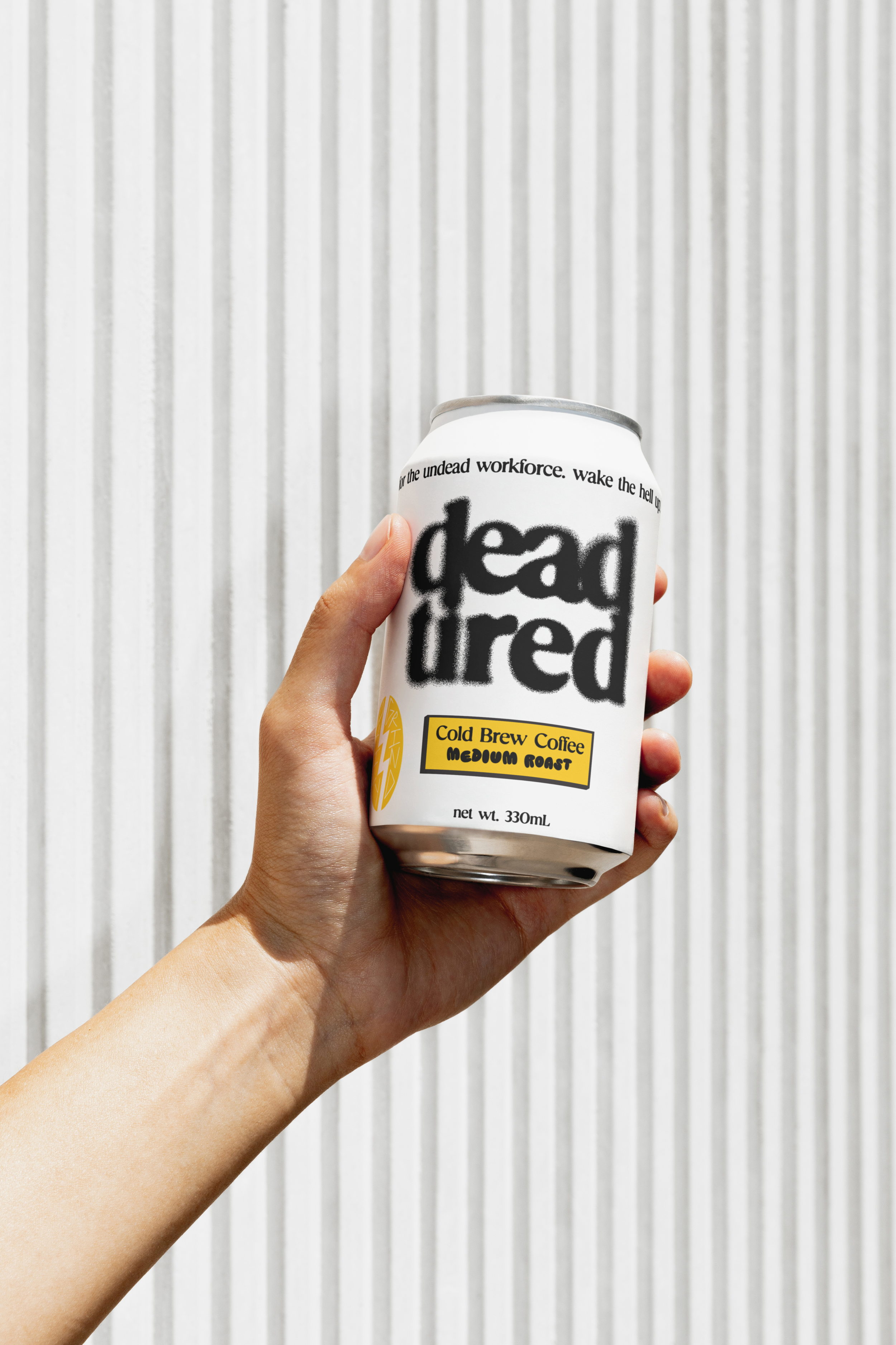
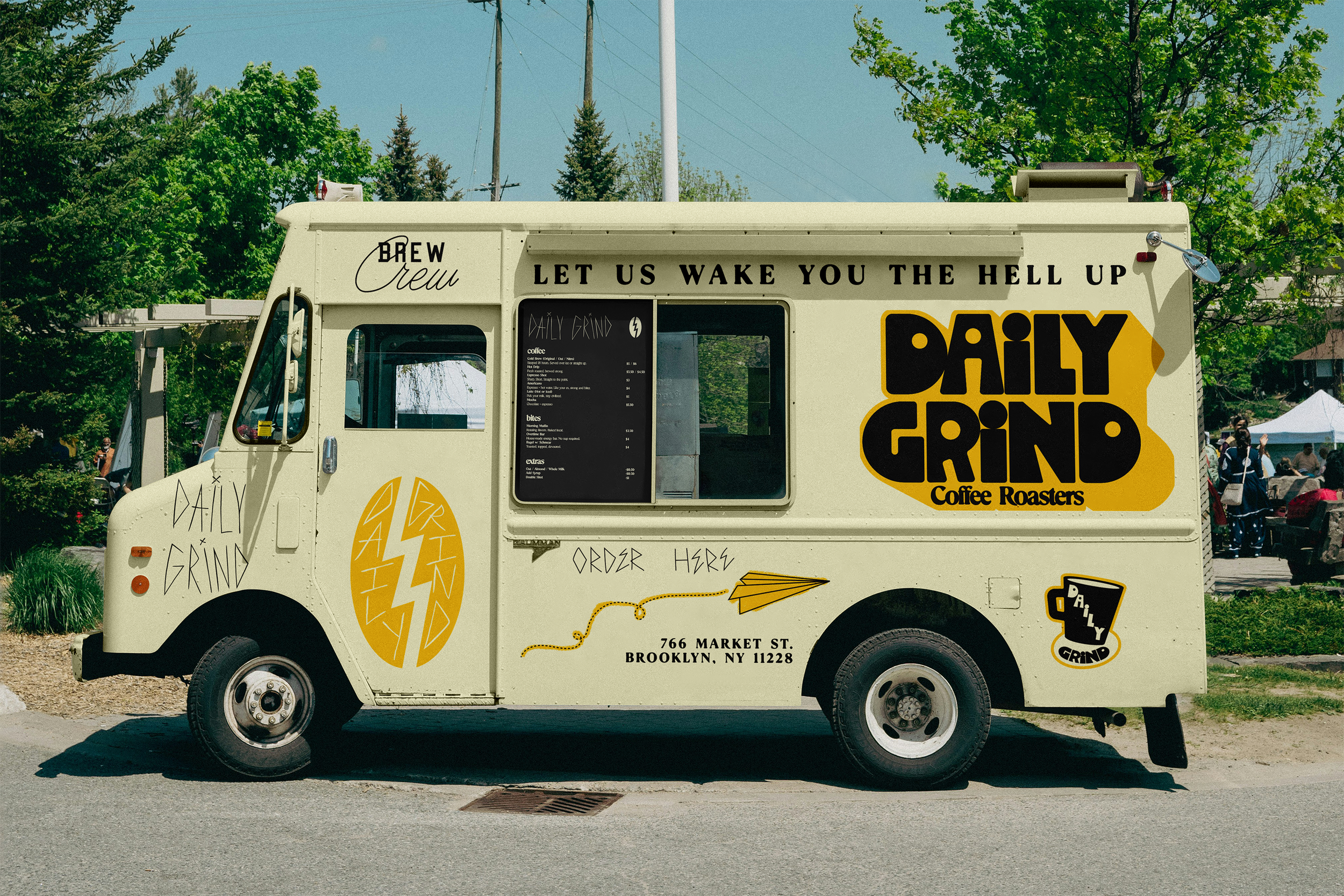
The final identity feels approachable, confident, and instantly recognizable. From retail bags to merch to storefront decals, Daily Grind’s logo brings a sense of play and purpose to every touchpoint. Early audience response has been overwhelmingly positive, with strong recall and clear differentiation from competitors.