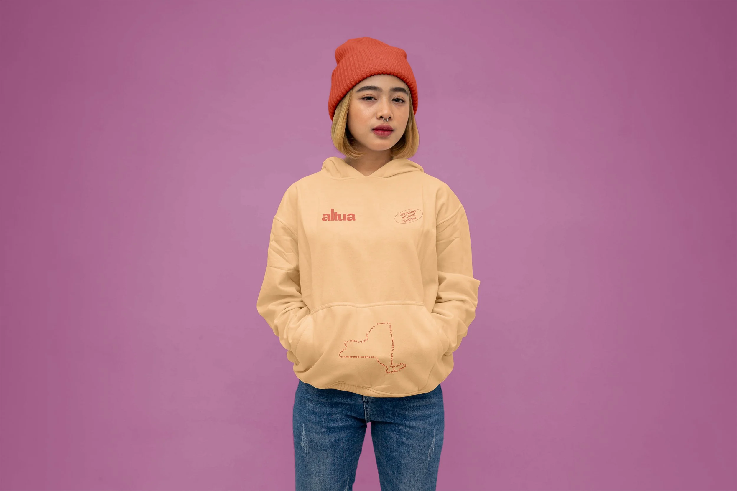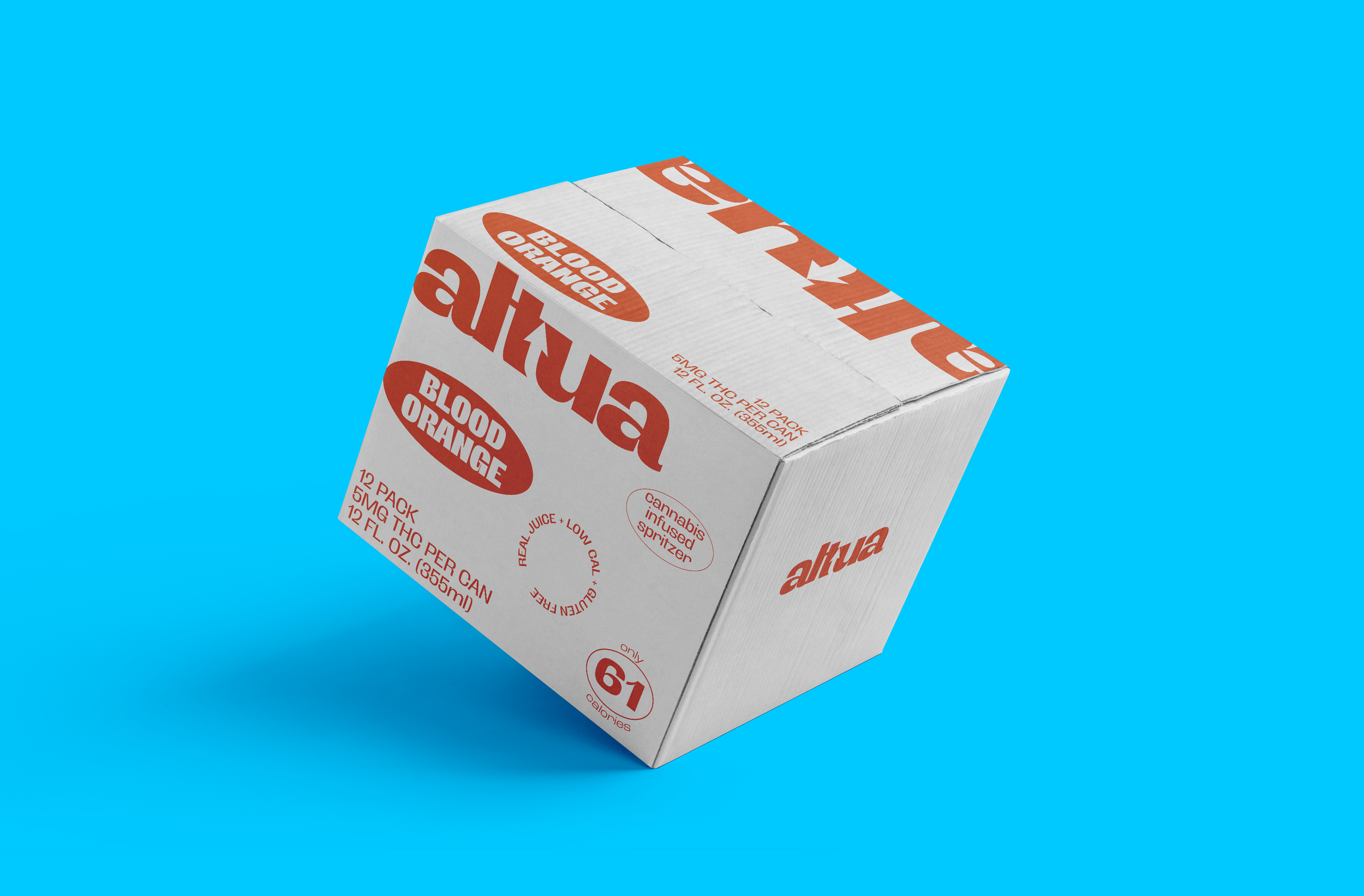

Case Study: ALTUA CANNABIS INFUSED SPRITZER
Cannabis Infused Spritzer
Scope: Naming · Logo Design · Brand Identity · Package Design
Overview
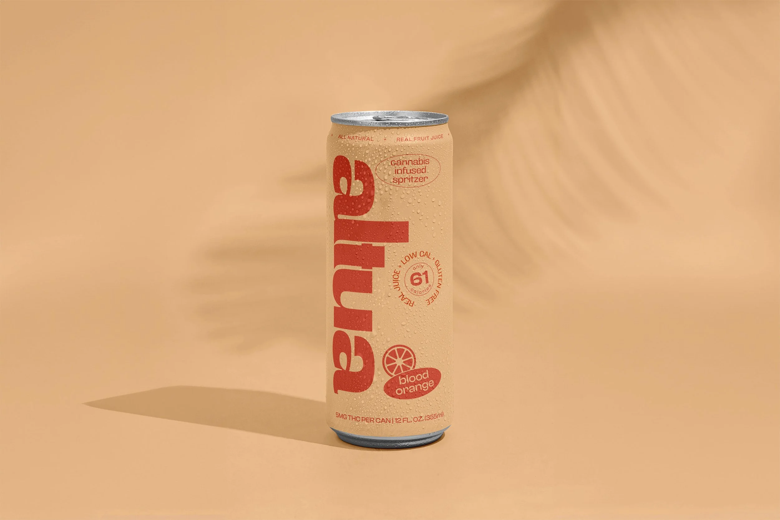
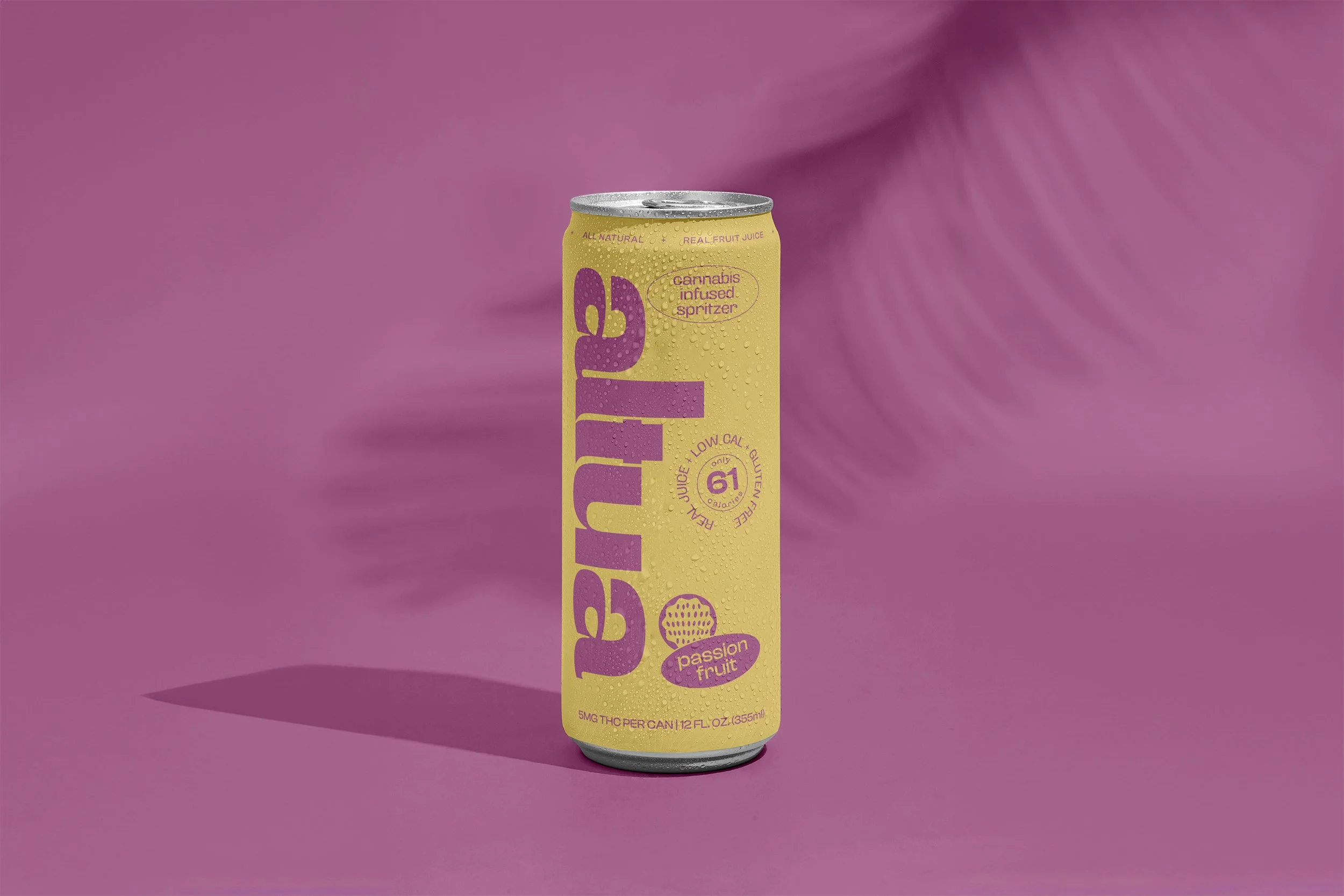
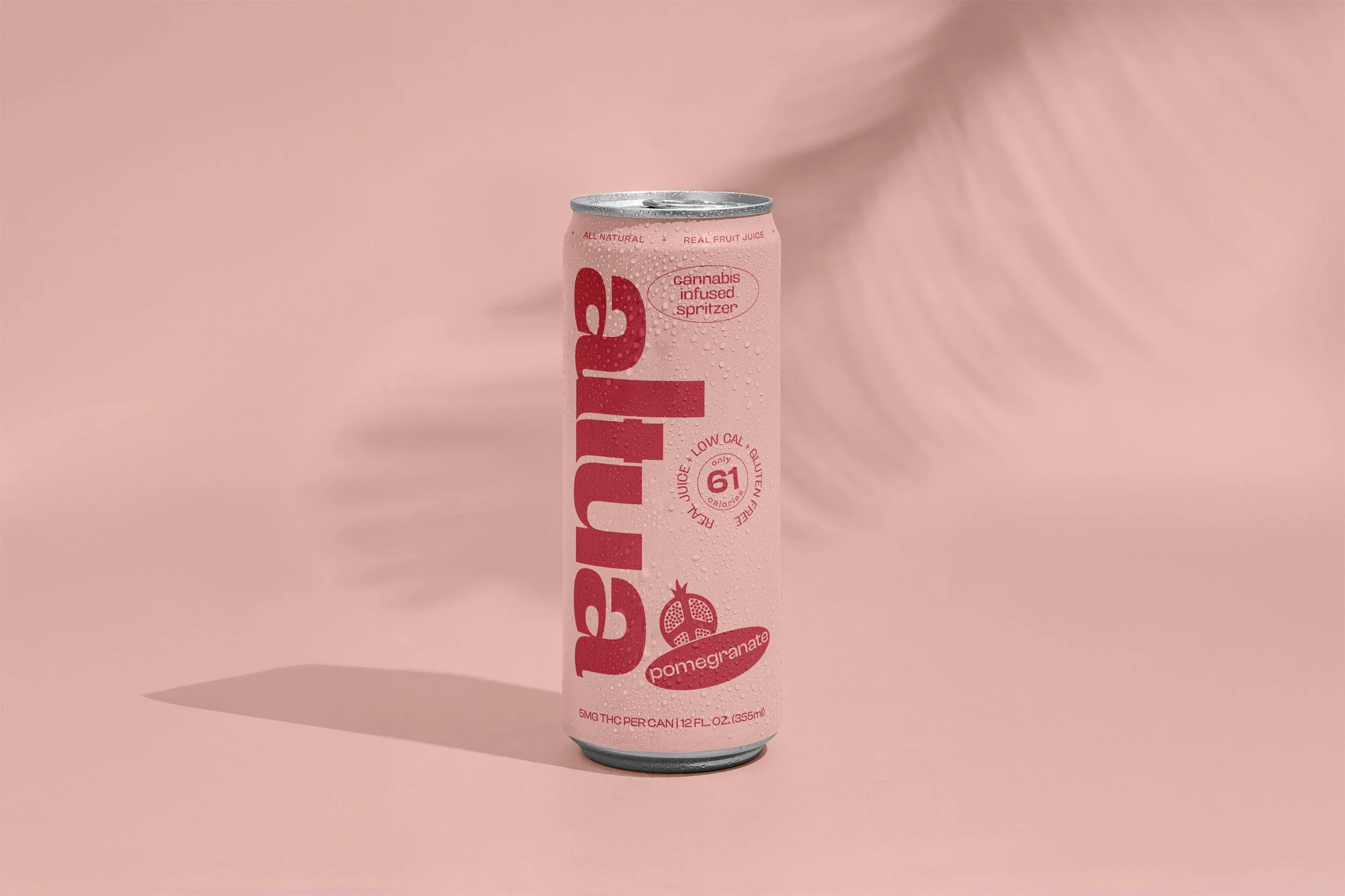
Altua is a cannabis-infused beverage crafted to elevate everyday moments with refreshing flavor and a modern approach to wellness. The name Altua evokes altitude, uplift, and a bright, optimistic energy.
Challenge
Develop a brand identity that:
Feels vibrant and approachable to a broad audience
Balances wellness cues with bold, contemporary style
Stands out clearly on crowded shelves and digital platforms
Solution
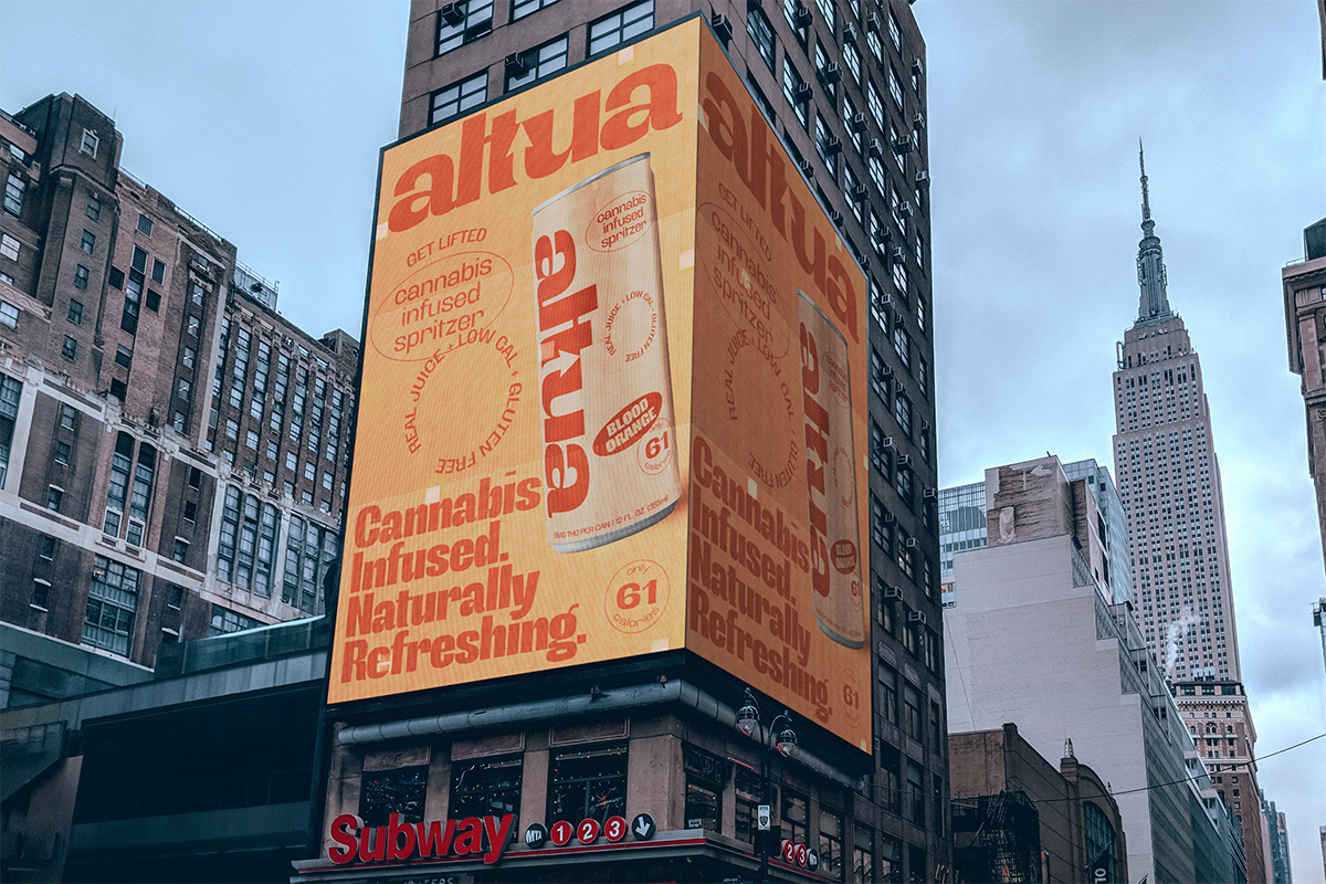
I designed a clean, geometric wordmark anchored by a distinctive upward arrow in the t — a visual metaphor for elevation and positivity. The lowercase, rounded letterforms communicate friendliness and ease, while the bright orange color conveys freshness and energy.
A minimal oval lockup — cannabis infused spritzer — reinforces product clarity and creates a dynamic contrast with the solid typography.
Outcome
The final identity feels modern, confident, and instantly recognizable. Whether on cans, merchandise, or social campaigns, Altua’s branding projects a sense of clarity and optimism that resonates with contemporary consumers seeking an elevated experience.