
Case Study: BLACK HARBOR BREWING
Craft Brewery
Scope: Naming · Logo Design · Brand Identity
Overview
Black Harbor Brewing is a craft brewery inspired by the grit and character of coastal life. The name draws from the raw energy of working harbors — places where stories, storms, and camaraderie converge. It speaks to both adventure and refuge, making it the perfect anchor for a brewery rooted in tradition yet open to exploration.
Challenge
Develop a visual identity that:
Captures a rugged, nautical personality without feeling cliché
Appeals to both seasoned craft beer drinkers and casual newcomers
Works seamlessly across cans, tap handles, signage, and merchandise
Solution
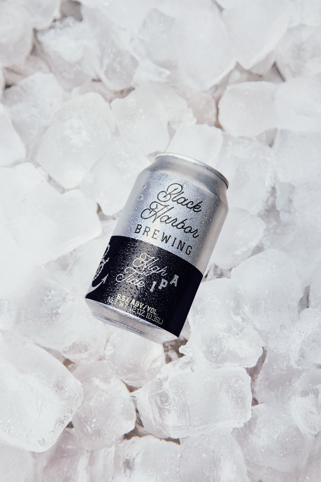
The identity centers on a bold anchor symbol entwined with rope, forming a monogram “B.” This instantly ties the brand to the sea while creating a memorable mark that functions as both an emblem and a storytelling device.
Typography plays a dual role:
A flowing script for “Black Harbor,” adding elegance and a sense of heritage
A blocky, utilitarian typeface for “Brewing,” grounding the brand with strength and readability
The contrast mirrors the brand’s balance — refined craft meets rugged character. The black-and-white palette underscores simplicity, versatility, and bold impact.
Outcome
The final identity embodies both strength and authenticity. The rope-and-anchor monogram gives Black Harbor Brewing a recognizable symbol that translates beautifully across applications — from taproom walls to pint glasses.
Customer response has highlighted the logo’s timeless quality and strong nautical presence, giving Black Harbor Brewing a brand identity that feels both adventurous and enduring. It positions the brewery as a beacon for craft beer lovers seeking flavor, character, and community.