
Case Study: Après
French–American Fusion Restaurant
Scope: Naming · Logo Design · Brand Identity
Overview
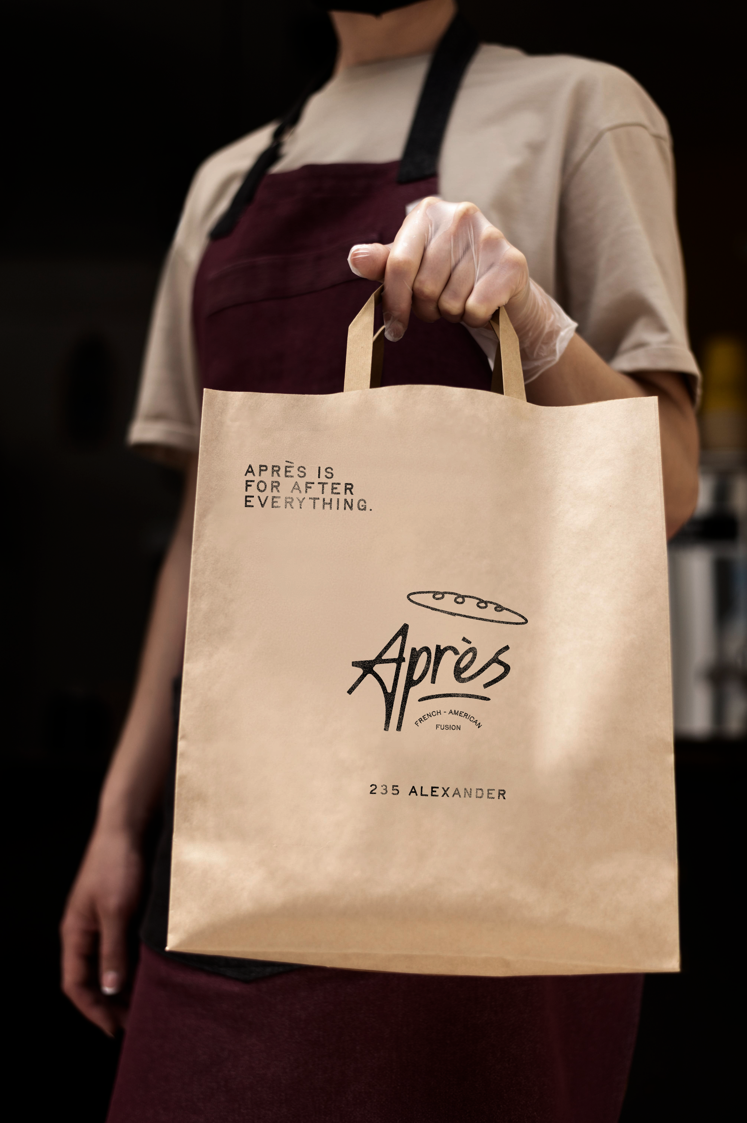
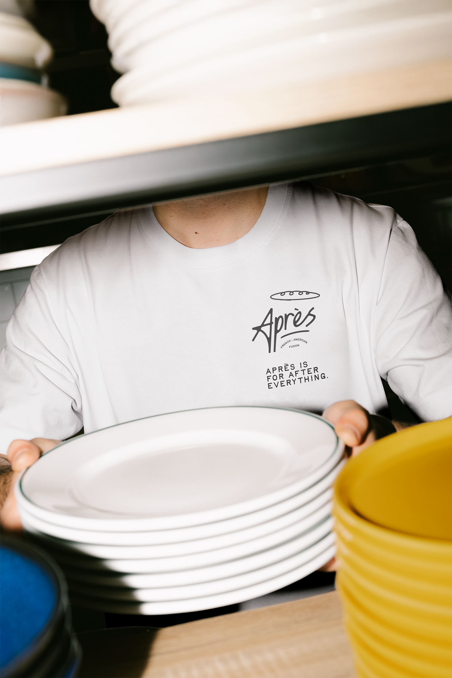
Après is a French-American fusion concept blending upscale comfort food with relaxed bistro energy. The name — French for “after” — captures the spirit of winding down, sharing a meal, and savoring the in-between moments.
Challenge
Create a brand that:
Feels elevated but unpretentious
Marries French charm with American warmth
Works seamlessly across print, digital, and interior applications
Solution
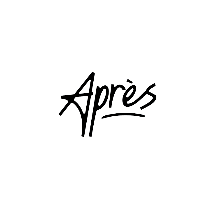
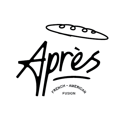
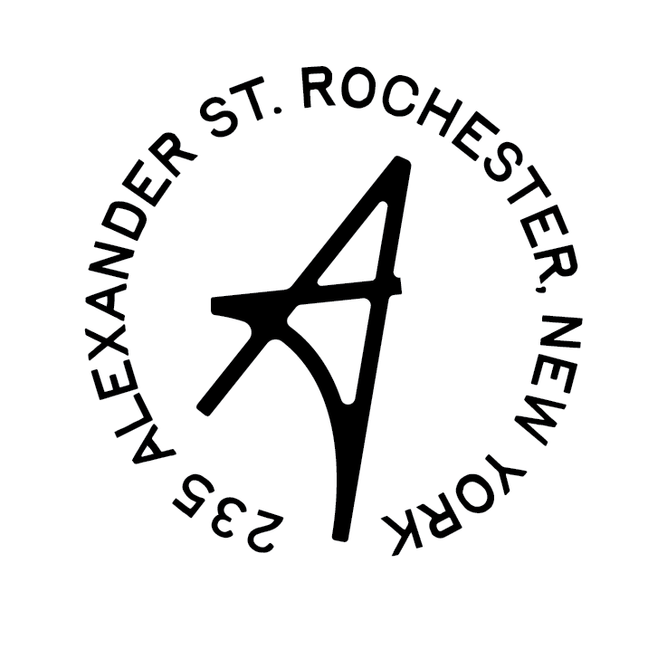
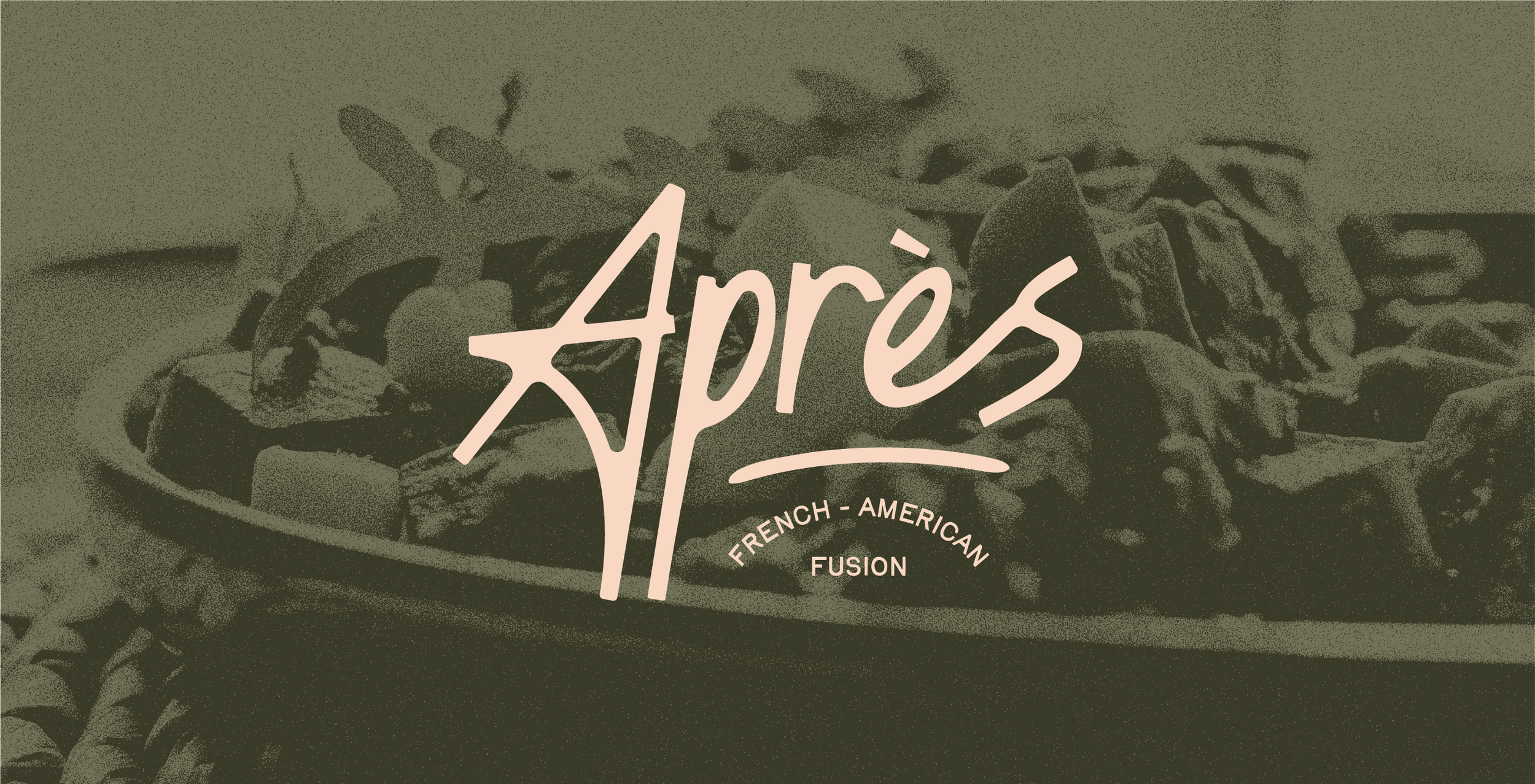
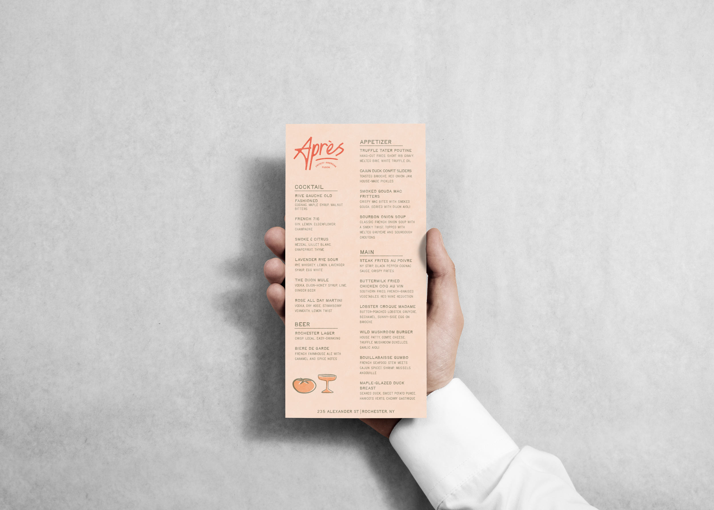
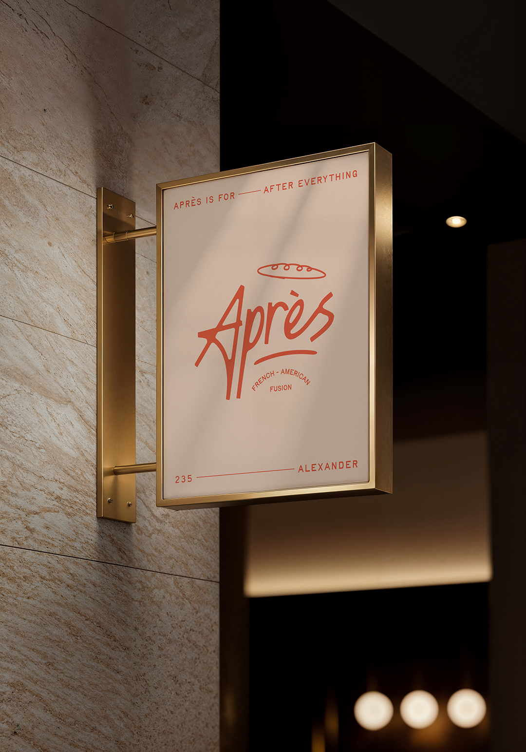
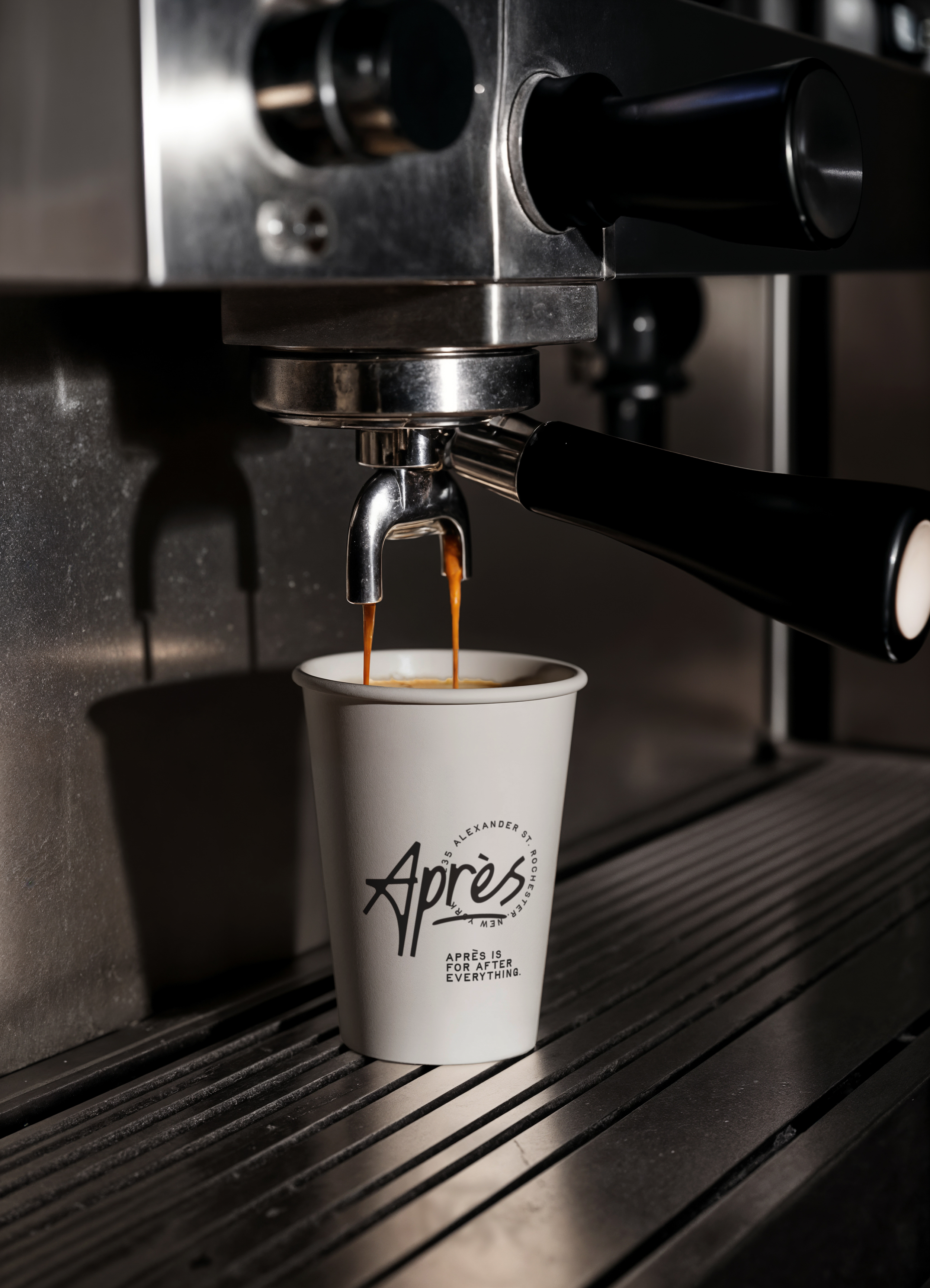
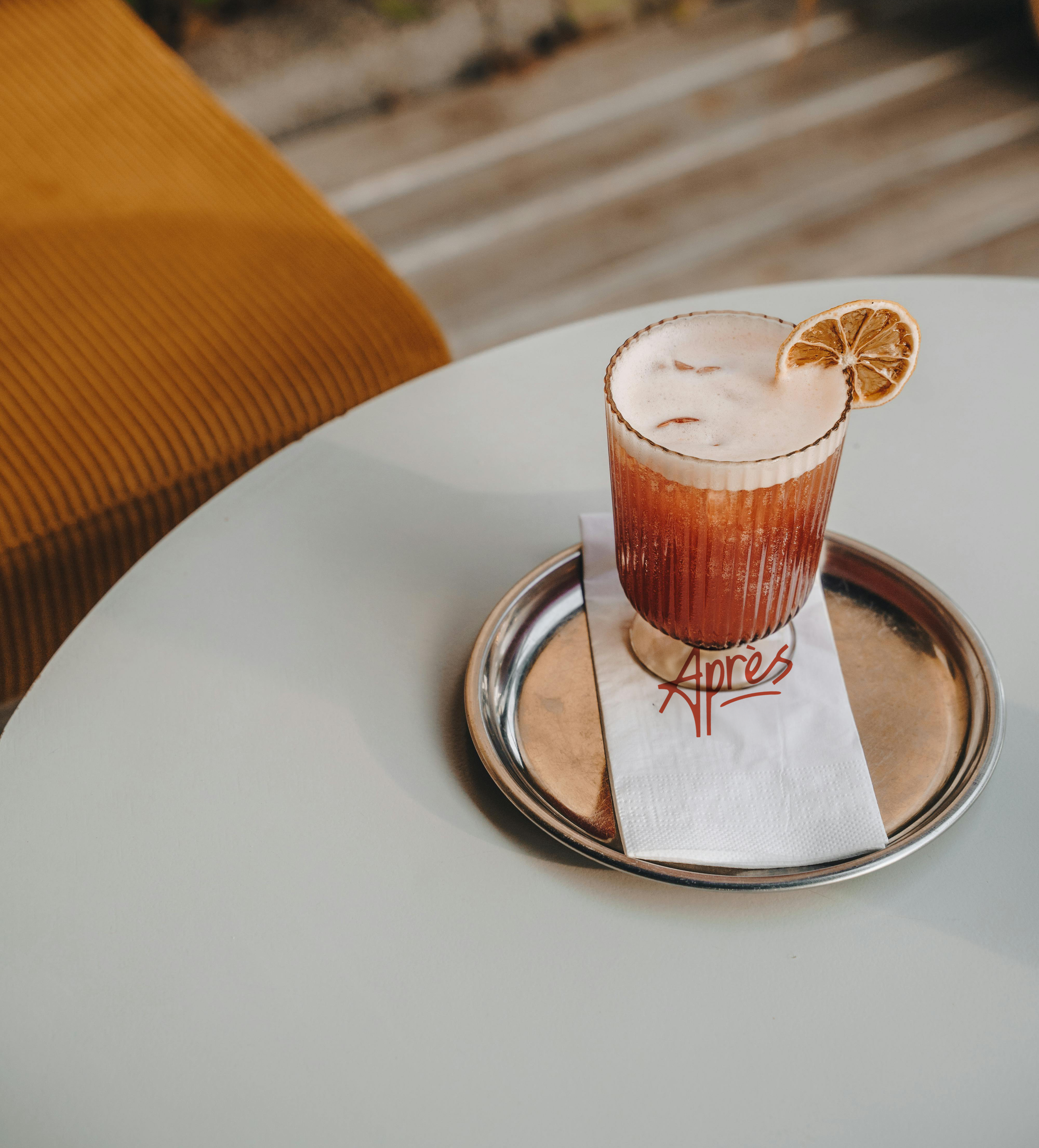
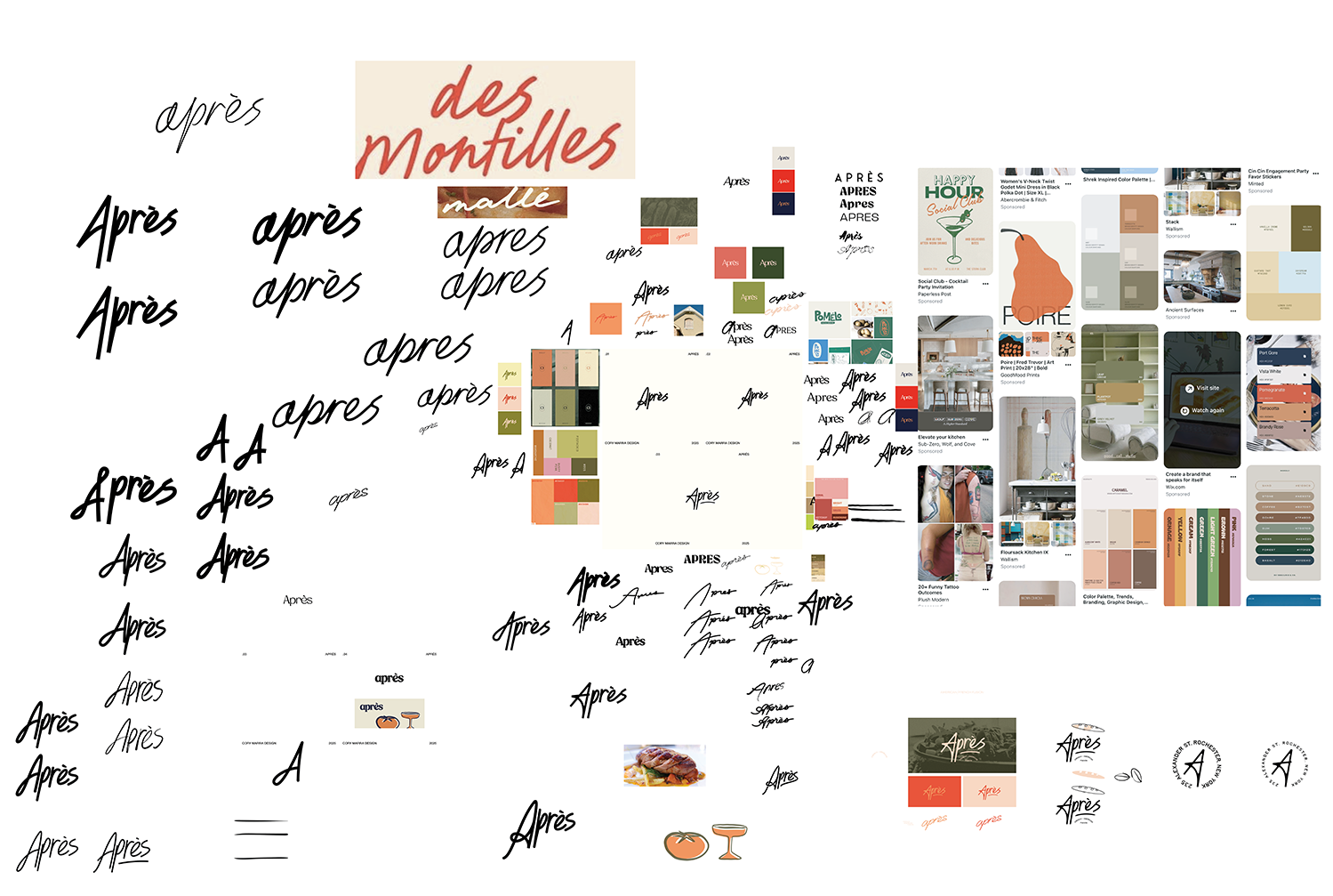
I developed a bold, custom wordmark that balances movement and friendliness. The exaggerated A adds instant personality, while the handwritten feel nods to both Parisian cafés and classic Americana signage. The subline (“French – American Fusion”) is clean, minimal, and grounded.
The color palette evokes both rustic dining and modern hospitality. Each tone was chosen for maximum contrast and adaptability across touchpoints like menus, signage, and social.
Result
The result is a fresh identity that communicates flavor, approachability, and a subtle sense of occasion. Après feels just as at home on a cocktail napkin as it does on a neon sign. Early feedback has been overwhelmingly positive from stakeholders and test audiences alike.